See Also: The intro post which links to all the other flavour posts.
In this post, we’ll be comparing the official Ubuntu desktop release with all the flavours we’ve been baking from cloud-init configurations, on a Raspberry Pi.
Contents
Ubuntu
Finally we come to the comparison with the official desktop. Obviously I don’t need to include any cloud-init bits here because … you just install the desktop image on your card and that’s it.

The official desktop has a few other simplicity tricks up its sleeve too: no need to explicitly select a Wayland-based desktop, you get one by default. The first-time setup wizard also handles configuring things like the keyboard layout and initial user without having to deal with YAML. So … points for simplicity?
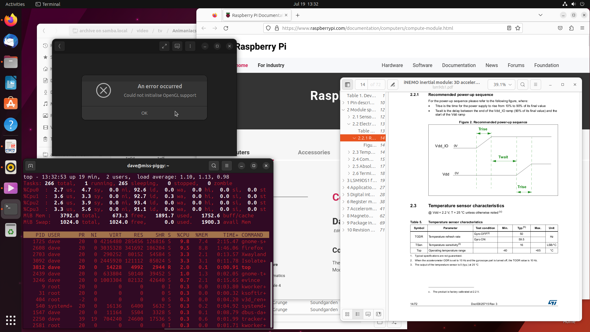
The default applications are a mix of the brilliant (the aforementioned Rhythmbox) and the … not so brilliant. In the screenshot above you can see Totem failing to play anything (LP: #1998782 is the Ubuntu bug, but the upstream bug has more details), so it was back to sudo apt install vlc. The incorrect audio selection bug (LP: #1993347) also popped up but is trivial as ever to deal with.
Everything else is mostly fine: good terminal, fine web-browser, stuff opens happily even on unmounted network shares, though (as noted before) dragging files from an archive to extract them doesn’t work (LP: #1923033). Though this is ultimately due to the Wayland transition, it’s notable that it does work in Kubuntu, even when running Plasma under Wayland.
One other difference worth noting is that on this distribution I stuck with using the snap version of Firefox because we may as well do a comparison of stuff “as it ships” here (which we can’t really do with the other flavours). Despite being a snap, the Wayland support works (once the MOZ_ENABLE_WAYLAND=1 setting is exported), and since LP: #1974064 was fixed [1] opening links from a standalone PDF reader works too.
Speaking of Wayland, all the desktop animations are generally smooth and don’t lag. With the exception of the start menu.
Oh dear, it’s rant time …
Sort it out!
The full-screen zoom-out animation is just too large to do smoothly even under Wayland (sometimes it manages it after a few attempts). However, this doesn’t bother me too much because, once it’s deigned to appear, I can never find stuff in it anyway.
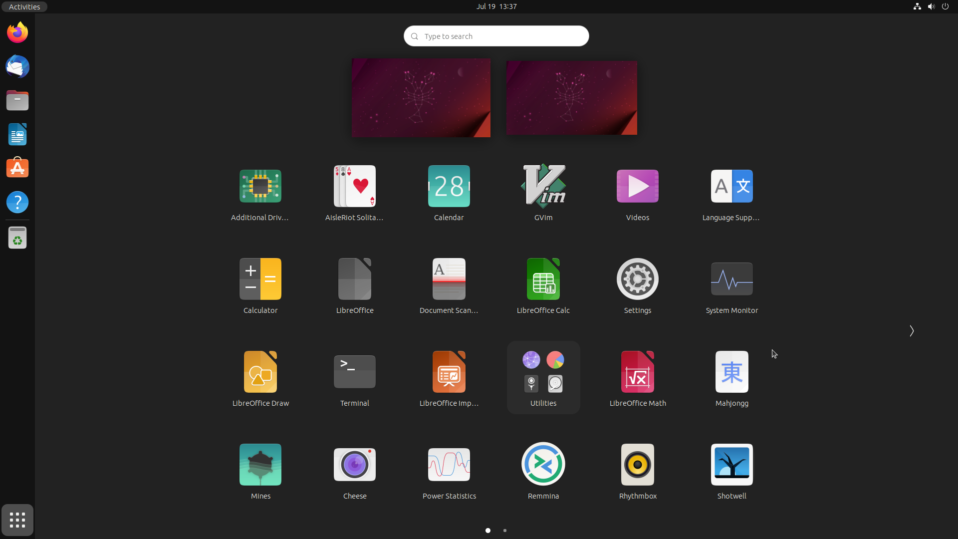
Some flavours have a categorical start menu: Lubuntu, Xubuntu, Kubuntu, and Studio. It’s a bit dated, but it works: find the category you want, scroll through the alphabetical list, and pick the application you want. Others take a more smart-phone-y approach and just have a big alphabetical list of everything installed to scroll through: Budgie, Unity … GNOME? GNOME has one big list. But it’s not alphabetical:

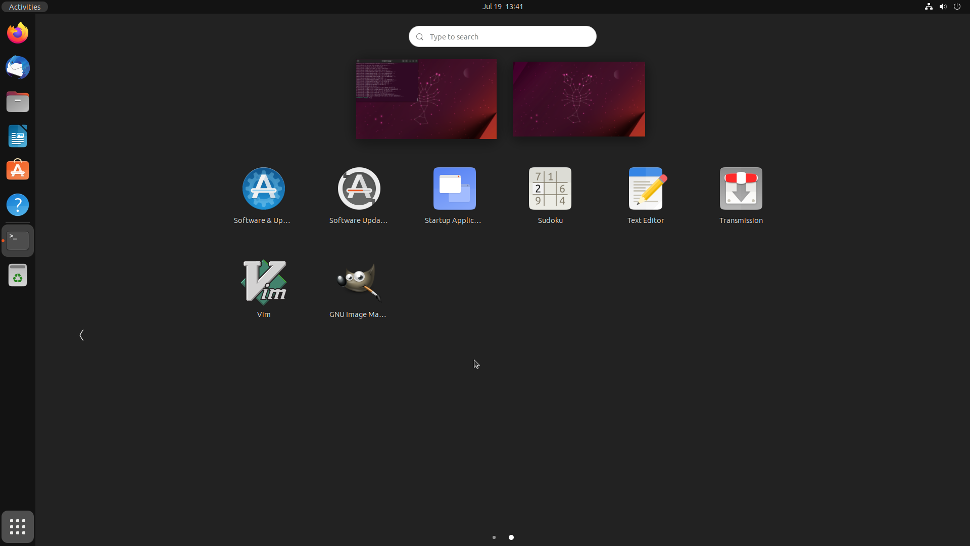
It’s not in most-recently-used order either. I have fired up Videos here, but not GVim for instance. Maybe something weird like installation order? Let’s install something and see. I’ve picked GIMP which, after installation, appears at the end of the list on the second screen, after all the other apparently alphabetically arranged items:

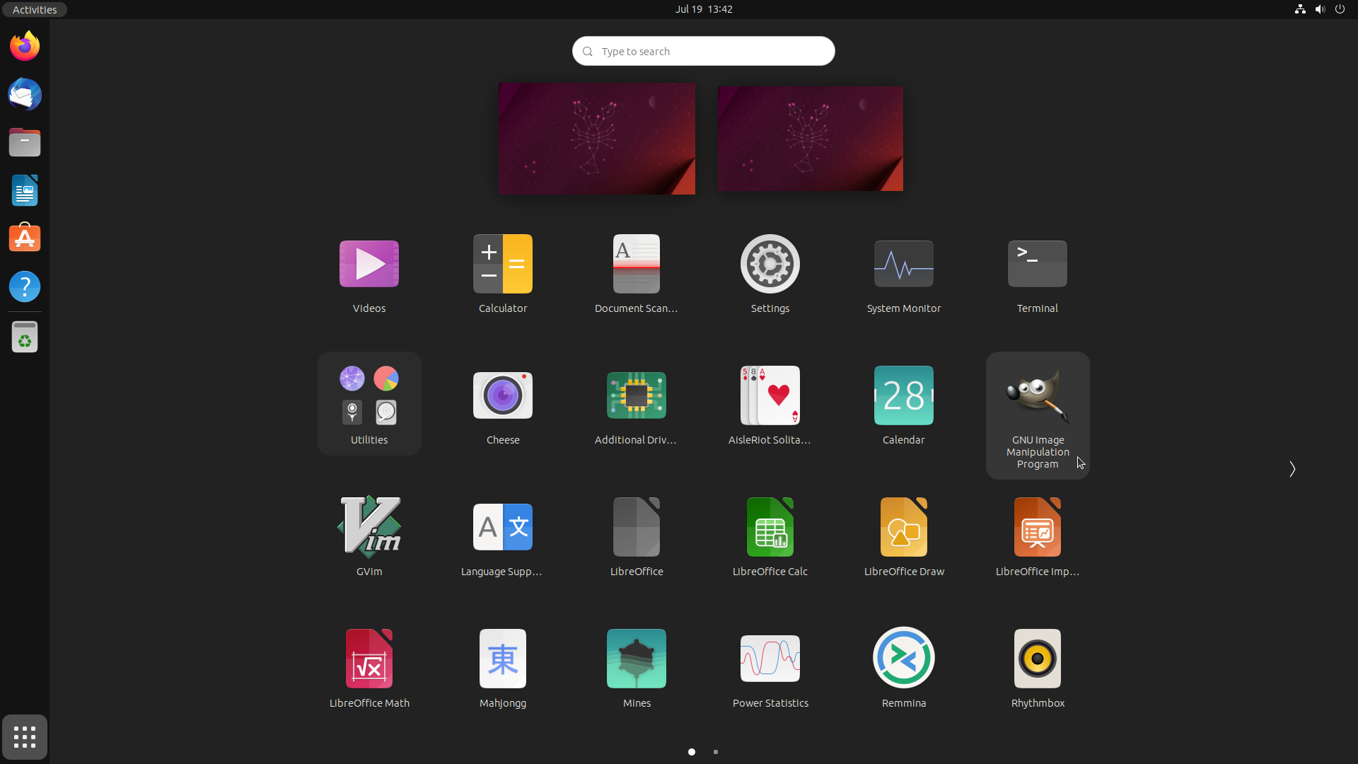
But, if we logout and login again, our start menu has re-arranged and now GIMP is before GVim, in apparently alphabetical order. But no! “Cheese” is now before “Additional Drivers” although prior to the reboot it came later in the list!

Okay, I give up. I’ve no idea what the order is here. Maybe it’s “whatever you want it to be”? You can re-order things manually by dragging them around, or drag them over each other to form groups (such as the pre-grouped “Utilities”). But this means that if I want a sensible layout (which the default … isn’t), I have to laboriously drag things around until they’re “just so”. I have to put work in (something no other flavour has demanded). Or if you just like them alphabetical then simply … erm … install an extension?
In essence the starter is a strange mash-up of “smart-phone home screen” and “smart-phone all-applications list”, made all the more smart-phone-y by scrolling sideways because … well, just because. The thing is … this isn’t a bug. This is genuinely GNOME’s idea of “how a start menu should work”!
The mitigation to this is that most flavours these days, including GNOME (but even some which favour a categorised menu like Kubuntu) allow you to search by just opening the start menu, typing a few letters of what you want, then hitting Enter when it’s the first in the list. This is how I tend to use the start menu on GNOME because it’s the only way it makes any sense. But, for this purpose I don’t care about the icons, and that in turns means I don’t care about giant full-screen zooming animations that lag the entire menu.
Okay, rant over.
Popping and locking
Oh, and the screen-saver? Blanks and locks the screen, but fails to suspend the monitor. I’ve dug into this before (LP: #1998716) and all I came away with was a new-found appreciation for how bloody complicated something as apparently simple as a screen-saver is, once you begin to understand all that it does.
Verdict
It’s not lightweight, but it is pretty, reasonably responsive, with a decent selection of apps, and despite a few Wayland transition issues (like drag and drop) it’s mostly functional … except for that start menu. Still, it can’t be that bad as it has been my main desktop for the last few years.
The problem is … now I’ve used Kubuntu …
| [1] | during the writing of this series in fact — this is another bit I’ve had to go back and re-write! |